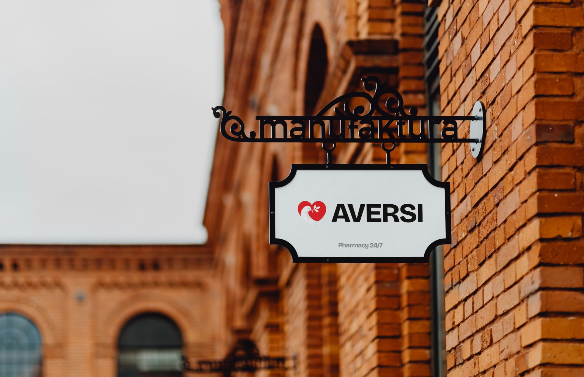
aversi pharma brand identity
aversi pharma has been operating since 1994, and judging by its visual identity, the logo has remained virtually unchanged since then. in this concept, I chose to preserve the brand's most recognizable elements — the bird, the olive branch, and the heart — while giving them a contemporary interpretation. the bird now has a more refined and complete silhouette, naturally integrated into the heart shape, while the olive branch has been simplified with bolder lines, making it much more recognizable at any size. the original typeface has been replaced with a confident, modern grotesque that gives the entire identity a stronger and more distinctive character.
Deliverables:
branding
concept
website design
Year
/
2026
Client
/
aversi pharm